Company Logo
The company logos for the Pinnacle Oath Consumer Oriented Company are not limited to the ones that are provided above. Any business that has received proper accreditation may receive a toolkit, with rules and regulations, in order to create their own logo. Examples of specific rules of logo creation involve: the company icon must be present in the logo, the placement of the company icon, positive word or phrase that reflects the goals and values of the company (respect, accredited business, etc.), and the colors black and white. An alternate color choice being discussed at the moment is “Money Green” (RGB: 33,108,42). At the moment, however, the color black is used due to its compatibility with the majority of newspapers.
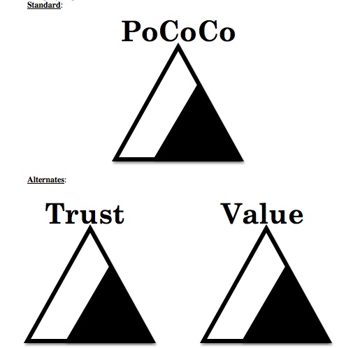
At first glance, key features regarding the company logo that stick out are its shape choice, color choice, symmetry and balance, simplicity, boldness, and word choice.
Shape:
The use of the triangular shape is meant to symbolize solidity. It should be felt in all respects of the goals and values of the company. It is also noted that the triangle seems to be the base of the logo. This portrays feelings that with PoCoCo accreditation as the foundation of the accredited company, the company will also be very solid and very strong.
The smaller triangle within of the larger triangle symbolizes that PoCoCo will guide a company farther than that (small triangle), and to the “pinnacle” of possibilities (larger triangle).
Color:
The color choices of black and white are mainly used because of compatibility issues with newspapers. Black and White are also two very strong and bold colors when placed with each other. Among many other reasons, such as readability, the black of the smaller triangle is negative; the white of the larger triangle is positive. While attention is drawn first to the smaller black triangle, the viewer soon realizes that there is a larger white triangle surrounding and surpassing it.
The color “Money Green” (which symbolizes wealth and successful business) has been discussed and may be used in the future; however, at the moment, it is still unused due to problems pairing a negative color along with it.
Symmetry and Balance:
The logo is balanced in a way by placing the two triangles in the center of the logo. The logo is initially weighted with negative weight and positive focus using the small black triangle, and then it is balanced slightly with positive weight and negative focus using the larger white triangle. That is that viewers will focus first on the smaller black (negative) triangle and then balance their view with a larger white (positive) triangle. However, it is still not necessarily balanced, as there is a large weighted white space due to the contrast between the large and small triangle. This is then rebalanced from the weight of the capital letter followed by lowercase letters of the word found centered directly at the pinnacle of the large triangle.
Boldness:
The boldness of the logo is seen in more than just the font and word found above the triangle. It may not be immediately noticeable but the two triangles themselves exhibit bold appearances in multiple ways. The two triangles are seen as bold by their basic contrast of black and white. The larger triangle’s thick borders also represent bold lines all around. Boldness is also simulated by the white triangle being larger.
